Make it
feel DNwide.
A working guide for the people who bring our brand into the world. The logos, type, image making and details that keep every expression consistent.
GLOBAL PERSPECTIVE.
01 / THE STANDARD
Talent at the center.
Confident, precise and human. A global fitness modeling agency with an editorial point of view.
DNwide
Use this spelling and capitalization in client materials, campaign credits and links. Keep “DN” uppercase and “wide” lowercase.
DOC N.I.L.
DNwide is the talent division of DOC N.I.L. Use “Powered by DOC N.I.L.” when a parent endorsement is needed. Keep the names distinct.
Fitness. In focus.
Show the person, the discipline and the commercial opportunity. Our presentation balances athletic capability with fashion and brand relevance.
Talent casting and representation use DNwide. Marketing and creative production use DOC N.I.L. A talent booking does not automatically include a production service.
02 / THE STANDARD
Give the mark room.
Use the supplied assets. Keep the wordmark legible, intact and separate from competing information.

Clear space
Keep at least the height of the capital “D” clear on all sides. Measure from the visible letterforms, excluding the file’s transparent canvas.
Minimum size
For the wordmark alone, start at 100 px wide on screen or 25 mm in print. Enlarge further if detail is lost. Keep descriptors separately readable.
Backgrounds
Use Ink on light surfaces and the reversed wordmark on dark surfaces. On photography, choose quiet negative space or a solid holding panel.
One shape. One color.
Scale proportionally. Use a high contrast monochrome treatment. Position with deliberate margins and an uncluttered background.
No effects on the logo.
Do not stretch, rotate, outline, rebuild, crop or add shadows and gradients. Do not replace the wordmark with a typed imitation or merge it into another logo.
The downloads reproduce the current website’s wordmarks. They retain live text and system font rendering. For fixed, outlined artwork, print production or an unusual placement, request a production master from the agency.
03 / THE STANDARD
Quiet palette. Clear signal.
These colors match the current DNwide website. Neutral surfaces carry the story; orange marks a meaningful moment.
Primary wordmark, headings and body text.
Main canvas. Give photography and typography room.
Small accents, focus and priority. Use sparingly.
Supporting text and metadata on light surfaces.
Secondary panels and quiet content groupings.
Lead with neutrals
Use Paper and Ink for most of the composition. Add Slate for supporting information and Mist for subtle separation. The site’s fine rules use #CFDAE2.
Keep contrast intentional
Use Ink for text on Signal. Keep small white type off orange. Never use color alone to communicate status: add a label, icon or other clear cue.

PARENT ARTWORK / SEPARATE EXPRESSION
Preserve the parent signature.
DOC N.I.L. artwork keeps its own dark and ivory surfaces and #FA6037 accent. Use the supplied parent asset as a unit; do not recolor it to match the DNwide interface.
HEX and RGB values are for digital work. For print, convert using the printer’s required ICC profile and approve a physical proof. Do not treat a screen color as a Pantone or universal CMYK specification.
04 / THE STANDARD
Type with purpose.
Editorial scale for ideas. Calm, readable text for information. Technical details stay precise and small.
Built for
what’s next.
System sans
The live site uses system-ui, with Apple system fonts and Segoe UI fallbacks. Use a neutral sans serif, restrained weights and tight display spacing. Body copy stays comfortably spaced. Georgia may add a short editorial accent.
system-ui, -apple-system,
BlinkMacSystemFont,
"Segoe UI", sans-serifTechnical mono
Use for section numbers, file labels and supporting specifications. Keep labels short; avoid long passages in capitals or monospaced text.
ui-monospace,
SFMono-Regular,
Consolas, monospaceBarlow Condensed
The site also includes Barlow Condensed Bold for select display treatments. Keep it to short statements and existing campaign styles. It is not a replacement wordmark font.
Fonts are not included in the asset kit. Use properly licensed font sources; system fonts are supplied by each device.
One leading headline, one supporting idea, then the details. Use sentence case for editorial copy. Reserve all caps and tracking for short labels. Keep body text at least 16 px on the web.
05 / THE STANDARD
Strength, seen with intention.
Human first. Athletic detail. Cinematic restraint. Every frame should communicate both personality and capability.
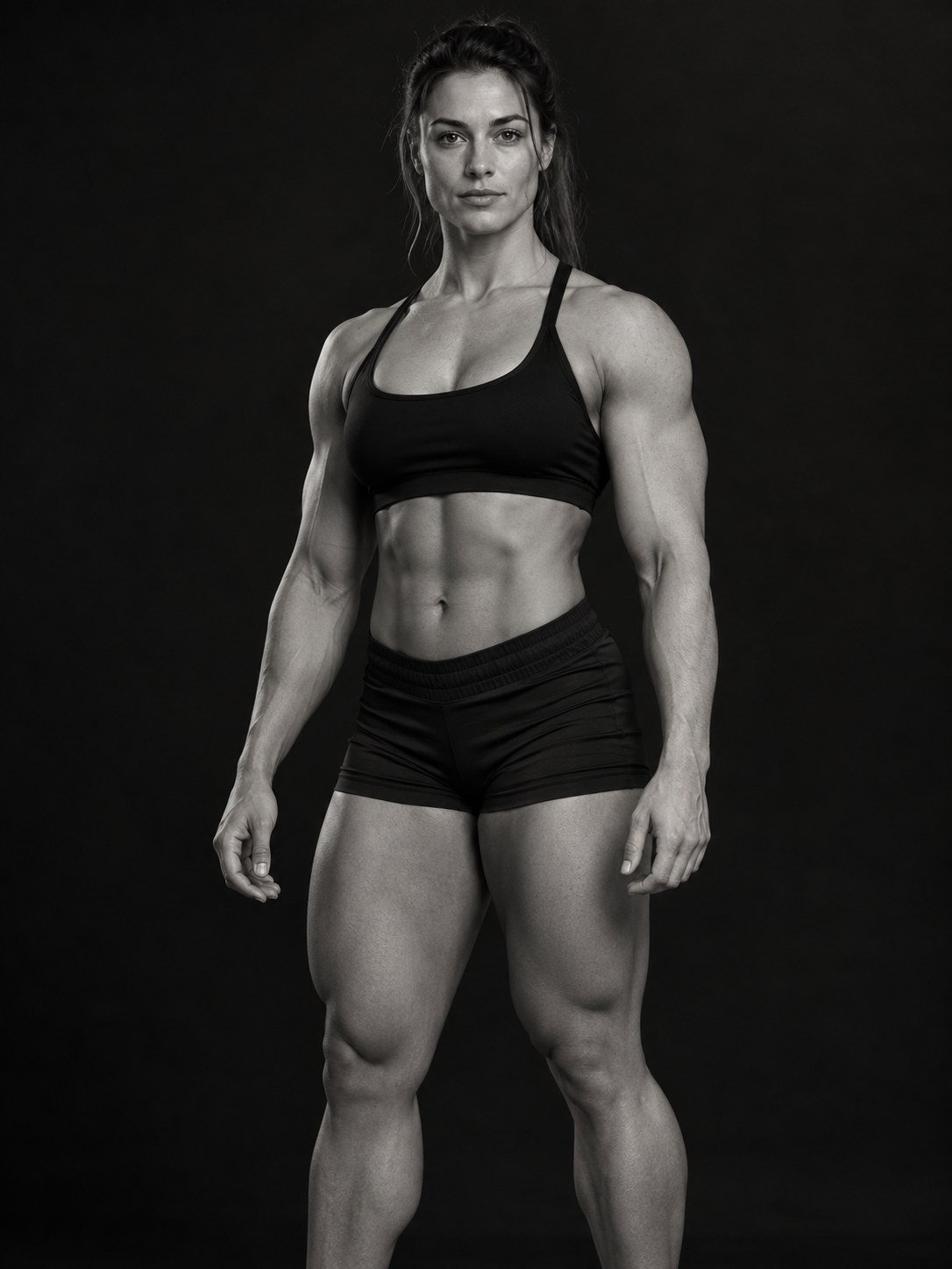
Photography
Favor directional light, clean compositions and honest skin texture. Mix portraits, full-body form and purposeful movement. Keep the talent recognizable.
Cropping + retouching
Leave room for the headline and wordmark. Protect faces, hands and important athletic detail from interface overlays. Preserve natural proportions and skin tones.
Motion + sound
Use controlled camera movement, clean transitions and deliberate pacing. Avoid flashing effects. Caption speech, provide a still alternative and respect reduced-motion preferences.
Casting + representation
Show talent as capable, individual people. Use respectful direction, consent-led poses and approved imagery. Do not imply a talent endorsement that has not been agreed.
Use only agency-supplied, cleared assets for the agreed campaign, media, territory and term. A website image is not a download license. Confirm retouching, AI alteration, synthetic likeness or new uses with the agency before production.
06 / THE STANDARD
Say it clearly.
Direct, confident and respectful. Lead with the opportunity and make the next step easy to understand.
“Send the brief.
We’ll find the talent.”
Short sentences. Specific action. A human point of contact.
Use concrete language
Say “Book fitness talent for your campaign” or “Request a casting search.” Name the service, the audience and the action.
Keep claims grounded
Use agency-approved biographies, credits and statistics. Confirm campaign claims before release. Avoid unsupported superlatives and promises of guaranteed outcomes.
Credit consistently
Use “Talent represented by DNwide” when appropriate. Use “Powered by DOC N.I.L.” for the parent endorsement. Link digital credits to dnwide.com.
07 / THE STANDARD
A system that travels.
Keep the same hierarchy across pitch decks, social posts, campaign pages and production materials.
In motion.
Layout
Use a clear grid, generous margins and a single focal point. Align labels, text and credits. Avoid placing multiple oversized statements in one view.
Social + presentations
Build for the destination: 9:16 vertical, 4:5 feed or 16:9 presentation. Keep essential information inside platform safe areas and check the actual mobile preview.
Co-branding
Separate partner marks with space, align their optical weight and retain each brand’s own colors and proportions. Agency approval confirms the relationship and placement.
Parent endorsement
DNwide leads on talent materials; DOC N.I.L. supports as the parent. Do not combine both names into a new mark or present a partner logo as an agency endorsement.
08 / THE STANDARD
The working files.
Start with the supplied web assets and keep this guide beside your brief.
Web reference assets
DNwide light and dark SVG wordmarks, DOC N.I.L. web references, color tokens and usage notes.
Download the kit 03 / AGENCY SUPPORTProduction artwork
Request outlined masters, print-ready files, a custom lockup or review of your finished layout.
Request artworkThe asset kit contains web reference exports, not font installers or fixed outlined logo masters. Brand assets are for the agreed agency relationship and campaign context. Share your intended use with the agency when requesting final artwork.
09 / THE STANDARD
Ready to go out into the world.
Use this quick check before sending your work for agency review. Include the final layout, destination, dimensions and intended launch date.
Use this as a working check. Your selections last for this page visit; final campaign approval comes from the agency.
Send a complete handoff
Include the source file, exported preview, format and dimensions, linked assets, font details, talent credits and the agreed usage scope. Name versions clearly: DNwide_Campaign_Channel_YYYY-MM-DD_v01.ext.
GOOD WORK STARTS WITH A CLEAR BRIEF.
Make it yours.
Keep it DNwide.
Talk to the agency Questions about a logo, layout or campaign? Send us the context.